Since 2011, we’ve kept track of and postulated the shift in the trend colours for furniture. The
fashion and furniture industries call the flavour of the times ‘trend colours’ simply because these are the tones that will harmonise the aesthetics for the year. Generally, trend colours emerge out of a study of the human condition at that point in time. Sentiment, the various things people buy, use and wear, the cycle of contrast, the influence of weather, and more. Manufacturers oft influence changes as well, and the case with furniture is a bit of both. Trend colours are more often temporal than culture changers, and they can affect furniture production as a whole, since adopting them calls for more varied inventory, sourcing and alterations in production routines.
The year saw a progression of the colours of the last 2 years. Last year, white was a base and the new colours existed merely to add life. The accent trend colours now have bceome much more. From accessories and smaller pieces of furniture, to larger interior elements such as walls and
fixed furniture everything carries these tones. These are then, the 3 colours that made it big in Milan2013; we have no doubt that these will continue for another 2 years, with the addition of a darker tone to build the inevitable colour contrast cycle.
BLUE is back, and was strongly evident at not just Salone and Design Week, but also in fashion. Last season, we saw the push for turquoise and aquamarine, and hence the advent today of clearer blues is but natural. As the primary trend colour,
leather and fabric upholstery, accessories of all sizes and shapes,
carpets and even new innovations sport various shades of blue. Sky blue and baby blue are the key tones. Blue is both warmth and positivity. Says the legendary Pasquale Natuzzi, “I personally believe that blue will come back as a lasting colour trend in interior design. Blue is very important for us as people - it means the blue sky, water and the soul.” Giusseppe
Nicoletti believes that while light blue is the new boy in town, pastels will dominate. A closer look at the fair reveals that several manufacturers did indeed produce furniture and accessories with a range of pastel tones.
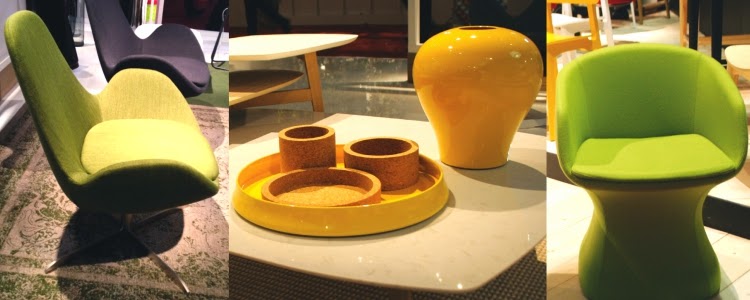
DEEP YELLOW-MUSTARD. The vibrant golden yellow tone and its darker cousin are the main relief colours of the year, as they were in 2012. Much upholstery, foil coverings and plastics today sport the tone in not small quantities. The tone is used to add life to not only
new styles, but also to designs that are well established. Mirroring the sentiment prevailing in Europe, we beleive that while the colour brings brightness to a grey market, it also represents energy - to do new things with vigour.
LIME GREEN or CHARTREUSE is the third critical tone for the year. While it has been in vogue for a while, the tone is still important today since it indicates an affinity towards the environment.
When it comes to textures and materials, colour tones find expression in terracotta finishes, natural marble, natural wood - especially ash, and copper. SS


Comments
Post a Comment